AZEEZ ADEBAYO
0%
CONTEXT
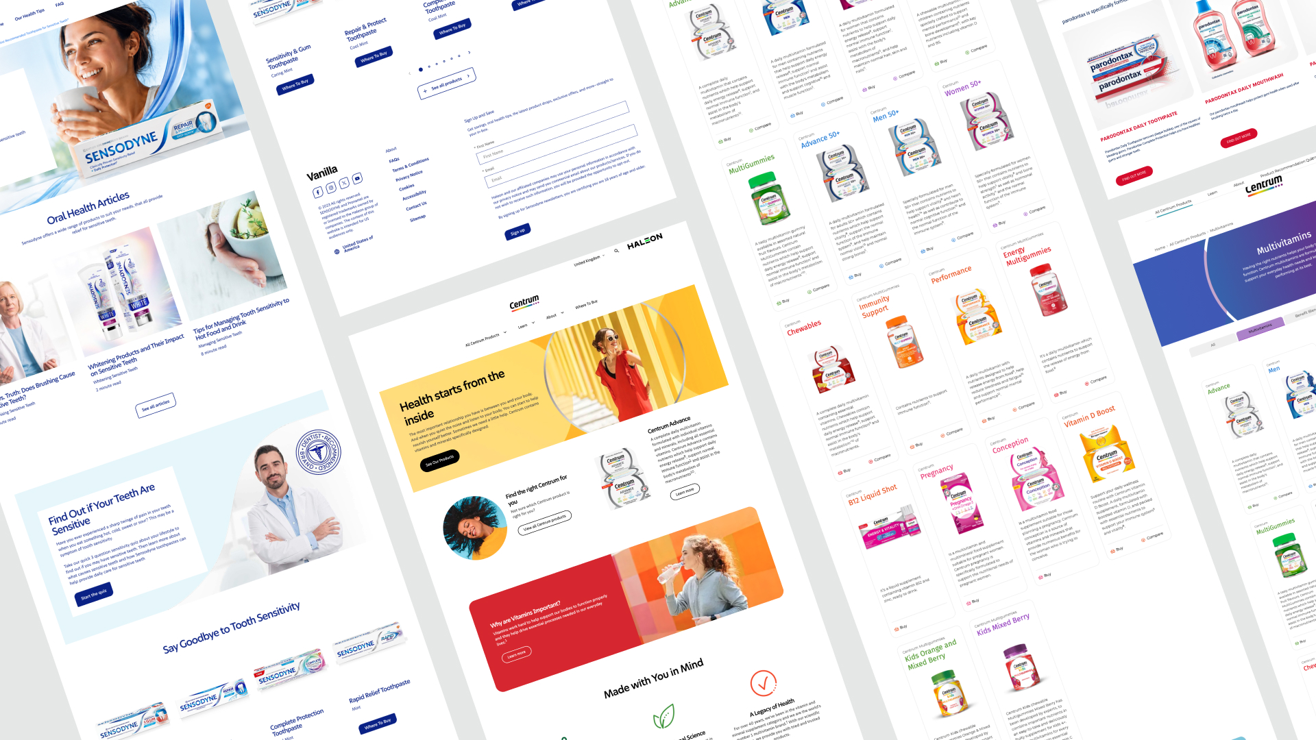
Haleon is one of the world's largest consumer healthcare companies, the company behind Sensodyne, Panadol, Advil, Centrum, Voltaren, and dozens of other household brands across more than 100 markets. After spinning out of GSK in 2022, the business inherited something that didn't quite fit its new shape: a sprawling portfolio of brand sites, product pages, and digital touchpoints, each built on its own logic, in its own toolkit, by its own team.
The result was a portfolio that looked like a portfolio, not like one company.
The result was a portfolio that looked like a portfolio, not like one company.
THE CHALLENGE
The brief wasn't "make it pretty". It was structural.
Haleon needed a single design language that could hold dozens of distinct brands without flattening them. Sensodyne couldn't start looking like Centrum. Panadol couldn't lose its market-specific equity. But every brand needed to share the same underlying grammar, the same components, tokens, accessibility standards, and editorial logic so that teams across markets could ship faster, more consistently, and on-brand without reinventing the wheel each time.
Haleon needed a single design language that could hold dozens of distinct brands without flattening them. Sensodyne couldn't start looking like Centrum. Panadol couldn't lose its market-specific equity. But every brand needed to share the same underlying grammar, the same components, tokens, accessibility standards, and editorial logic so that teams across markets could ship faster, more consistently, and on-brand without reinventing the wheel each time.
GOAL
Build one design system that Haleon could run the entire portfolio on, flexible enough to hold every brand's identity, strict enough to keep the company speaking with one voice, and operational enough that any market could ship from it without us in the room.
Concretely, the work had to:
* Unify the visual and interaction language across 15 brands and 170 markets without flattening brand equity.
* Cut duplication in design and engineering between regional teams.
* Shorten the time to launch a new brand site or campaign page from months to weeks.
Set the accessibility, performance, and editorial bar that every future Haleon digital product would be measured against.
APPROACH
I built the work around four decisions:
Atomic design as the structural backbone. Atoms, molecules, organisms, templates, and pages are applied rigorously so every brand can compose from the same primitives without cloning each other.
Tokens as the brand layer. Colour, type, spacing, motion, and elevation are all expressed as tokens. Brands swap the values; the system stays intact.
One source of truth in Figma, mirrored in code. Components designed and engineered in parallel, with documentation written for both designers and developers.
Governance built in from day one. Clear contribution rules, version control, and a review path so the system would survive contact with 170 markets and dozens of stakeholders.

LEADING THE WORK
As Lead Product Designer, my job wasn't only to design the system but also to make sure the team around it shipped at a senior bar, that the client trusted the direction every step of the way, and that "good" was defined explicitly so nothing slipped through the cracks.
(LEADING THE TEAM)
I led a team of 10 designers and 6 engineers across 2 time zones / regions. Three things ran the rhythm:
Clear ownership, no overlap. Every component, token group, and documentation page had one named owner. Reviews were collaborative, but decisions had a single seat.
Weekly critique with a written brief, not a vibe check. Each crit started with the problem statement and the constraint. We critiqued against the brief, not against taste, which kept feedback honest and made juniors confident enough to push back.
Designed in pairs, shipped in pairs. Design is always paired with an engineer from week one. By the time a component reached production, both halves of the team had skin in the game, and there were no handoff surprises.
I also made deliberate space for the team to grow. Junior designers led their own components end-to-end with me as a sounding board, not a gatekeeper. The system wasn't just an artefact; it was the team's training ground.
Managing client expectations
A global client at Haleon's scale doesn't have one stakeholder; it has dozens, each with a different definition of success. I treated expectation management as a design problem of its own:
Set the contract early. In the first two weeks, I co-wrote a one-page document with the client defining what we were and weren't building, what "done" looked like, and how we'd measure it. Every later debate revolved around that page.
Show work weekly, in the same format. A standing Friday review with the same structure, what shipped, what's in flight, what's blocked, and what we need a decision on. Predictability builds trust faster than polish does.
Translate, don't shield. When trade-offs came up, I gave stakeholders the real options and the real cost of each, in plain language. No design jargon, no false binaries. People rarely push back on hard decisions when they understand them.
Surface risk before it surfaces itself. I'd rather flag a slipping milestone three weeks early than apologise for it on the day. That posture changed the relationship from "vendor delivering work" to "partner co-running the programme."
Defining best in class
"Best in class" is a phrase that means nothing until you write it down. Early in the project, I led a working session with the client to define it specifically for Haleon rather than in the abstract.
We landed on five non-negotiables, and every component, screen, and pattern was reviewed against them:
1. Accessible by default. WCAG 2.2 AA, baked into the components, not retrofitted. If a pattern couldn't pass, it didn't ship.
2. Brand-flexible without being brand-agnostic. A component had to feel native in [Sensodyne]'s world and in [Centrum]'s world without either looking watered down.
3. Performance-first. Every pattern was budgeted for file weight, render cost, and motion overhead. Visual richness couldn't come at the cost of [LCP / Core Web Vitals].
4. Globally legible. Tested across [English, Arabic (RTL), CJK scripts]. If the type, spacing, or layout was broken in any of them, the pattern wasn't done.
5. Documented well enough that a new designer could ship with it on day one. If the docs needed a Slack message to make sense, the docs needed work.
Those five rules turned "best in class" from a marketing line into a working filter. They also made it easier to say no to feature requests, to off-brand exceptions, and to short-term fixes that would erode the system later.

Solution
Solution
The system gave Haleon a shared digital grammar that any brand in the portfolio could pick up and apply without losing what made it itself.
What it produced:
* A token-driven theming layer that lets a brand team launch a new market site without touching component code.
* A component library covering the [80+] patterns used across Haleon's digital ecosystem — navigation, product detail, claims, regulatory disclosures, content blocks, forms.
* Editorial and accessibility standards are baked into the components, not bolted on after.
* A governance model that defines who proposes, who approves, and how the system evolves quarter by quarter.
(OUTCOME)
* Reduced time to launch a new brand site from 24 months to 10 weeks
* Adopted across 12 brands and 170 markets within the first year.
* Cut design and engineering duplication across regional teams by an estimated 60%.
* Established the first shared design language in Haleon's history as an independent company.
* Adopted across 12 brands and 170 markets within the first year.
* Cut design and engineering duplication across regional teams by an estimated 60%.
* Established the first shared design language in Haleon's history as an independent company.
LET'S TALK
LONDON, UNITED KINGDOM